Intro
A coordinated party looks effortless, but it’s the result of intentional choices. With a clear plan and a few practical tricks you can make every element—tables, decor, food stations, and activities—feel like part of the same story.
This guide gives step-by-step techniques you can use for any scale or style of event, plus a quick checklist and a short FAQ to make execution simple and reliable.
Choose a simple palette and define the mood
Start by selecting two dominant colors and one accent. Limiting the palette prevents visual clutter and makes it easy to match disposable items, linens, and centerpieces. Decide whether the mood is casual, elegant, playful, or minimalist—this will guide material choices (matte vs. metallic, natural vs. plastic) and set expectations for guests.
Make the table setting consistent
A cohesive table is one of the fastest ways to make a party look coordinated. Use matching plates, chargers, and glasses in repeatable groupings so each guest sees the same composition. Consider grouping items by place setting rather than mixing different styles across the table; it reads cleaner and photographs better.
Shop or reference cohesive options for plates and serving pieces here: Dinnerware and Serveware.
Layer linens and textures
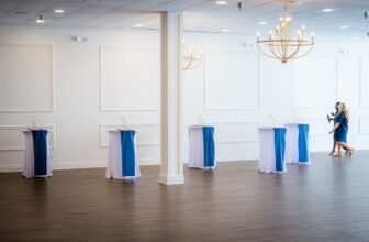
Start with a base layer (tablecloth or runner) and add napkins and placemats for contrast. Textures—linen, woven placemats, or a glossy runner—add depth without clashing when the color palette is kept simple. For table foundations and theme-appropriate fabrics, look here: Tablecloths.
Keep centerpieces and focal areas intentional
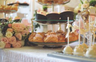
Choose one focal area per table: a single larger centerpiece or a small cluster repeated down the table. Low centerpieces keep sight lines open; taller pieces work on buffet or side tables. For cake or dessert focal points, use matching display pieces to reinforce the theme—cakes look more intentional on coordinated stands: Cake Stands.
Use balloons and large visuals strategically
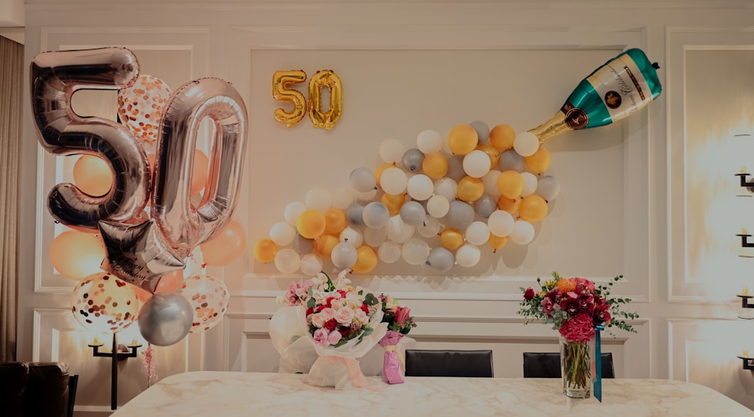
Balloons remain one of the most effective ways to unify a space because they create volume and repeat color. Create one or two balloon installations—an arch at the entrance or a backdrop at the food station—and keep the rest of the room visually quiet to avoid competition. Balloon kits and color-matched sets help you execute a polished look: Balloons.
Choose decorations and signage that reinforce the theme
Signage, banners, and small props should echo the palette and type treatments (fonts, iconography) used on invitations. Keep typefaces to one or two complementary styles. For table labels, hanging signs, and small accent pieces that match your theme, browse the curated options under Decorations.
Plan food stations and serving flow
A coordinated layout helps guests move naturally and reduces congestion. Group similar items together—drinks at one end, hot food in the middle, desserts at the far side—and repeat visual cues (matching trays, label cards) across stations. Standardize servingware so every station reads as part of the same setup: Serveware.
Stock consistent party essentials
For disposable basics and extras—cups, utensils, skewers, disposable plates—choose styles that fit your palette and mix only within the chosen range. Keeping all disposables in the same finish (matte white, kraft brown, metallic) immediately raises the perceived quality. If you need a one-stop source for coordinated essentials, check Party Supplies.
Think about the overall event layout
Beyond decor, the physical flow, seating arrangement, and activity placement should feel deliberate. Map the space: entry, welcome area, main gathering, food, and restrooms. Use clear visual anchors (color blocks, banners, or a dessert table) so guests intuitively understand where to go. For larger logistics and event kit items, browse Event and Party Supplies.
Small details that make a big difference
Consistency is often in small repeats: matching napkin rings, uniform name cards, or a repeating accent ribbon on centerpieces. Choose one finishing touch—metallic trim, a branded sticker, or a single fresh flower type—and apply it across all tables and stations to tie everything together.
Quick practical checklist
- Pick 2 main colors + 1 accent color.
- Choose a single table setting style and repeat it for all guests.
- Layer a base linen + contrasting napkin or runner.
- Create 1–2 focal installations (balloon arch or dessert table).
- Use consistent serveware and disposable choices.
- Map guest flow: entrance → main area → food → seating.
- Apply one finishing detail across elements (ribbon, tag, or flower).
FAQ
Q: How many colors are too many?
A: More than three makes coordination harder—stick to two dominant colors and one accent for clarity.
Q: Should I match every single item exactly?
A: No. Aim for harmony, not uniformity. Matching the main categories (tables, linens, balloons, serveware) is enough; small variations add interest.
Q: What’s the fastest way to upgrade a casual party?
A: Swap mismatched disposables for a single coordinated set, add a simple centerpiece repeat, and anchor the entrance with a balloon installation.
Q: How do I keep costs down while maintaining a coordinated look?
A: Reuse household serveware with coordinated linens and simple DIY signage. Focus budget on a few high-impact items like a backdrop or matching tablecloths.
Q: When should I hire help for styling?
A: If the guest list is large or the venue is complex, consider professional help to optimize flow and execution. For small gatherings, a clear plan and checklist are usually sufficient.
Conclusion
Coordination is about repetition, restraint, and thoughtful placement. Pick a simple palette, repeat core elements, and design a clear flow—those three steps alone will make your party feel polished without adding stress.