How to Match Colors for a Stylish Party Setup
Color is the quickest way to set the mood and shape guests’ perception of your event. A well-chosen palette makes simple supplies look coordinated, photos pop, and the whole gathering feel intentional.
This guide gives straightforward, practical steps to choose and apply colors across decor, table settings, lighting and activities so your party looks polished without stress. Start by thinking big-picture and then layer in details with purpose — from tablecloths to balloons and centerpieces.
Browse our selection of ready-made decorations if you want fast, color-coordinated options to build from.
Start with a clear color strategy
Before buying anything, decide the mood you want: calm (neutrals, soft blues, greens), festive (bright primary colors), elegant (deep jewel tones + metallics). Limiting your choices prevents visual clutter and guides every purchase.
For a full set of coordinated pieces that match a mood, it helps to browse broad categories of event and party supplies to see what color families are available and what items are easiest to mix and match.
Use the color wheel — simple combos that work
Three basic, reliable approaches:
- Monochrome: different shades and textures of one hue for a cohesive, modern look.
- Complementary: two colors opposite on the color wheel (blue and orange) for bold contrast.
- Analogous: neighboring hues (teal, blue, purple) for a harmonious, layered effect.
When choosing combinations for party accents and favors, check typical retail groupings in the party supplies section to see which palettes are commonly stocked together.
Pick a primary, secondary, and accent color
Keep it simple: choose one dominant color (50–60%), a secondary color (30–40%), and an accent (10–15%). The dominant covers large surfaces — e.g., table linens or a balloon arch — the secondary fills smaller decor, and the accent adds pops (napkin rings, cake toppers).
If you’re using balloons as a major visual element, choose a balloon palette that includes your primary and accent colors so installations feel integrated rather than tacked-on. Browse our balloons category for combinations and sizes that make planning easier.
Match table linens, textures, and finishes
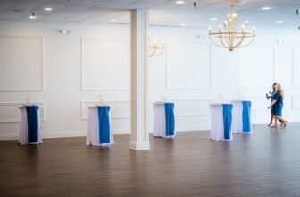
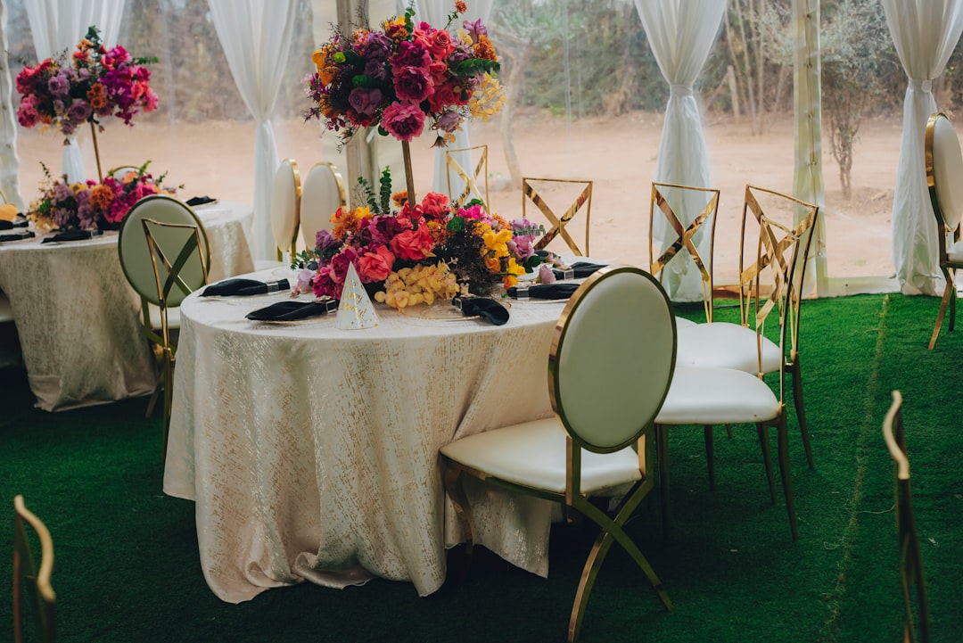
Tables anchor a party visually. Start with your tablecloth — its color and finish will set the tone for serveware and centerpieces. Matte linens read more casual; satin or metallic tablecloths read formal.
Use a neutral tablecloth with colored runners for flexibility, or select patterned linens that echo your palette. If you need quick options, check available tablecloths to see standard colorways and sizes that simplify planning.
Coordinate dinnerware and serveware
Match plates and glasses to your palette without becoming matchy-matchy. Options that always work: white or cream dinnerware with colored chargers or napkins, or transparent glassware with metallic accents.
Choose serve pieces with finishes that complement rather than compete. For example, pair matte plates with glossy cake stands or metallic serving trays to create visual contrast. See coordinated options in our dinnerware and serveware collection for inspiration and matching sets.
Design dessert and focal displays
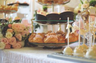
The dessert table is a focal point — treat it like an installation. Use a backdrop in your dominant color, a runner or risers in the secondary color, and accent pieces like florals or signage in the accent color.
Investing in a simple elevated base for cakes and cupcakes makes color choices read cleaner. If you’ll present layered desserts or multi-tier cakes, browse our cake stands to find heights and finishes that support clean color presentation.
Plan activities and zones to complement the main palette
If your party includes active zones — kids’ play, inflatables, or outdoor games — tie them into your scheme so they don’t feel like visual islands. Use color-coded signage, matching bunting, or a few accent balloons at each activity to unify the look.
For children’s events or backyard parties with play equipment, consider coordinating colors with inflatables or activity gear. Our inflatable bouncers selection shows common colors and scale so you can match play items to overall decor.
Lighting, metallics and how color shifts
Remember that color changes under different light sources. Warm incandescent light deepens reds and oranges; daylight makes colors truer; LED washes can shift hues dramatically. Test samples in the actual venue lighting if possible.
Metallics and reflective surfaces are powerful accents: a gold vase, silver candle holders or mirrored trays will read differently depending on light and surrounding colors — use them sparingly as accent pieces to enhance your palette.
Checklist: Quick color-matching steps
- Choose a mood first: calm, festive, or elegant.
- Pick a 3-color system: primary, secondary, accent.
- Test colors under expected lighting before buying major items.
- Anchor the room with tablecloths or a large backdrop.
- Coordinate balloons and installations with dominant colors.
- Use neutral dinnerware and add color via linens and serveware.
- Tie activity zones into the palette with small matching elements.
- Reserve metallics for accents, not the base palette.
FAQ
- How many colors should I use for a party? Aim for three: a dominant, secondary, and one accent to keep the look cohesive.
- Can I mix patterns with solid colors? Yes — pair one patterned element with solid colors drawn from the pattern to avoid visual clash.
- What if my venue has strong existing colors? Use neutrals (white, cream, gray) as a buffer and introduce your palette through linens, decor and lighting.
- How do I choose balloon colors that won’t overwhelm? Use balloons as accent installations (arches, clusters) in one or two of your chosen palette colors instead of covering the whole space.
- Is it better to buy coordinated sets or mix individual items? Coordinated sets save time and ensure color harmony; mixing allows customization but requires careful sampling.
Conclusion
Matching colors for a stylish party is a mix of strategy and simple rules: pick a clear mood, stick to a three-color system, test under real lighting, and use key items — tablecloths, serveware, balloons, and focal displays — to anchor the palette. With a plan and a few well-chosen pieces you’ll create a cohesive, memorable setup without overbuying.